Blogely UI upgrade
We know that responsive and intuitive user interface design can lead to better onboarding and app usage results.
We are rolling out the new Blogely UI upgrade and here are some principles we have followed.
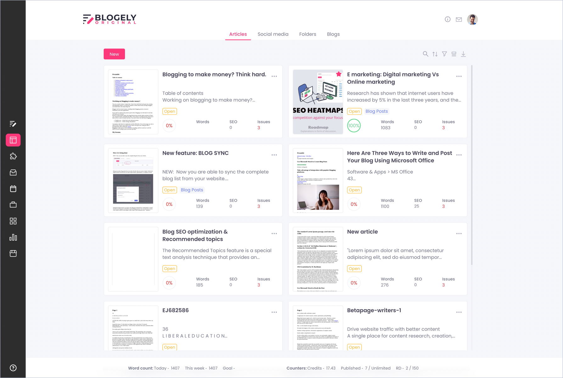
Simplicity. A simple user interface is better. We avoid unnecessary elements or design elements that could lead to confusion.
Consistency. To ensure that users understand the application quickly, we used familiar UI elements throughout the application.
Easy navigation. We make sure that the menu is not hard to find. We make sure each part of the app is clearly labeled in the navigation menu and place them in strategic places so users can find them quickly.
Appropriate typography. We tested different typographies and chose the one that suits our brand.
Suitable colors and textures. We made sure to use colors and textures appropriately to grab your attention.
Effective user control. We gave you as much control as possible, including default options, flexibility, and more.
Optimal accessibility. We made sure that the user interface is accessible and visible to any type of user, and that the user can get where they need to go.
4